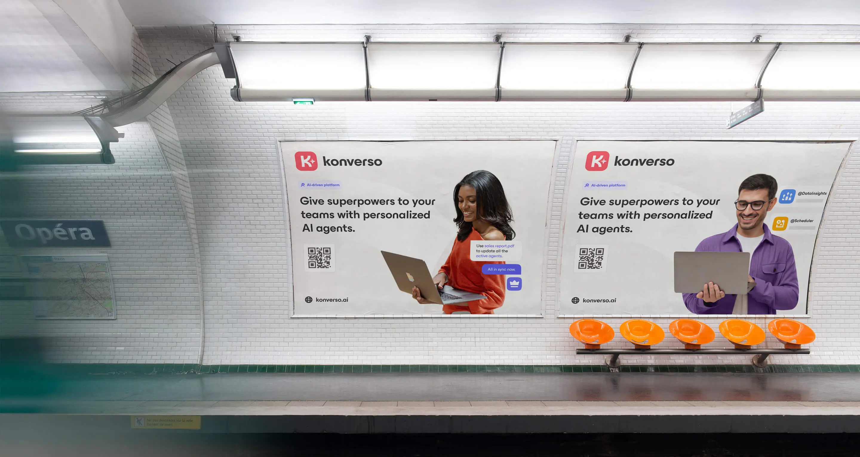
Konverso
Give superpowers to your teams with personalised AI agents.
AI built for business, designed for people.
Together with Konverso, I developed a new brand identity to reflect their mission of bringing responsible, secure generative AI into everyday business operations.
A strategic shift towards SMB audience
Building on its enterprise legacy, Konverso set its sights on a new frontier, inviting SMBs into its evolving story. The refreshed brand humanises their technology and puts end users at the centre, while embracing a distinctly European sensibility rooted in trust, humanism, and craftsmanship.
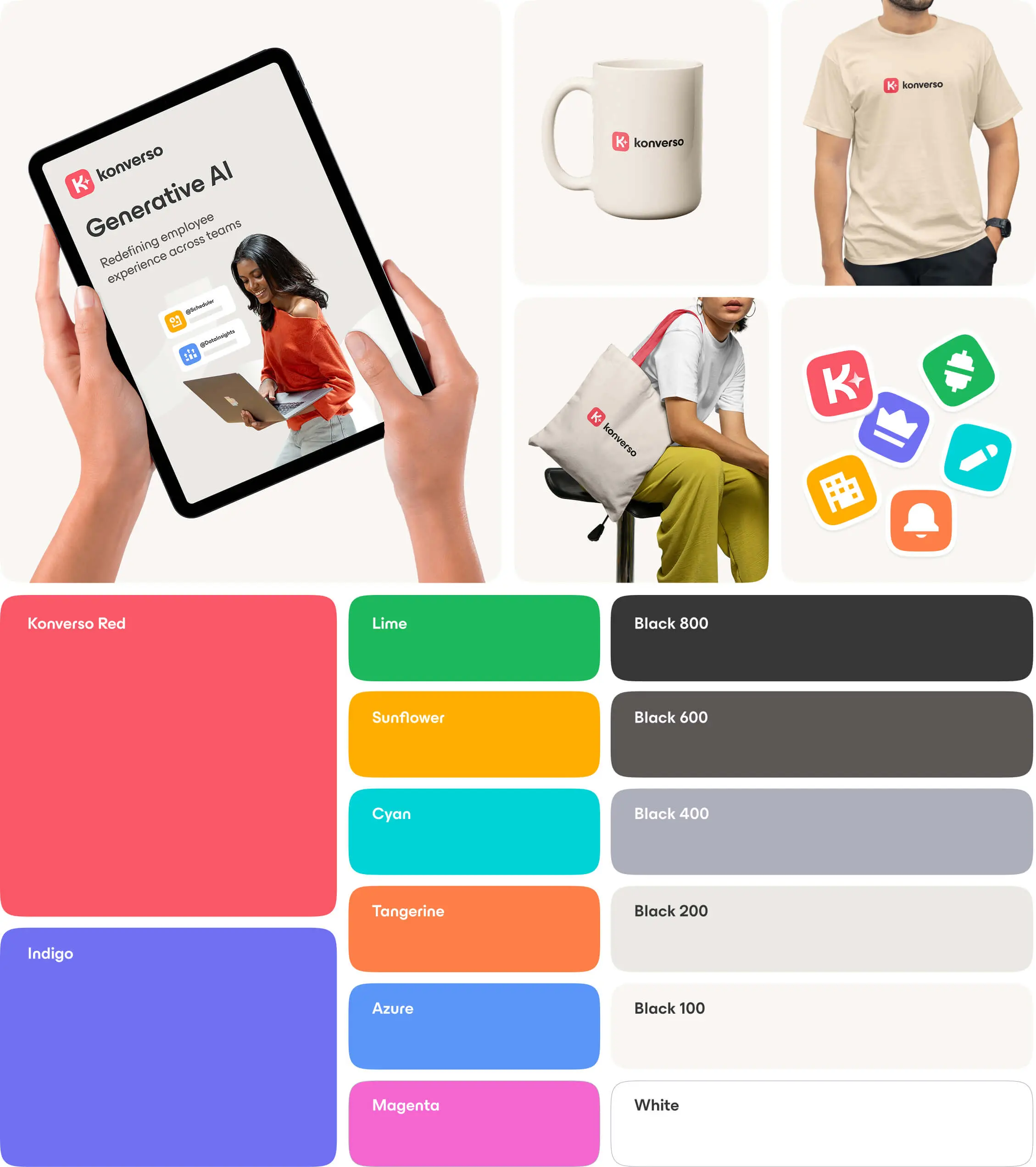
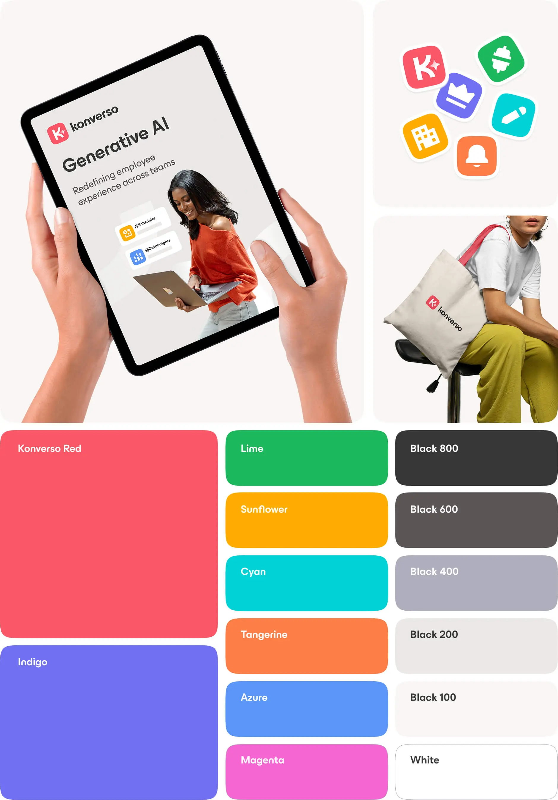
Painting productivity in colour
A refreshed identity called for a renewed canvas. Bright yet balanced accent colours infuse the brand with warmth and optimism, reflecting the positive energy of a modern workplace. Konverso's soft red anchors the palette as its primary colour, while Indigo highlights AI features, creating a clear visual hierarchy that balances approachability with professionalism.
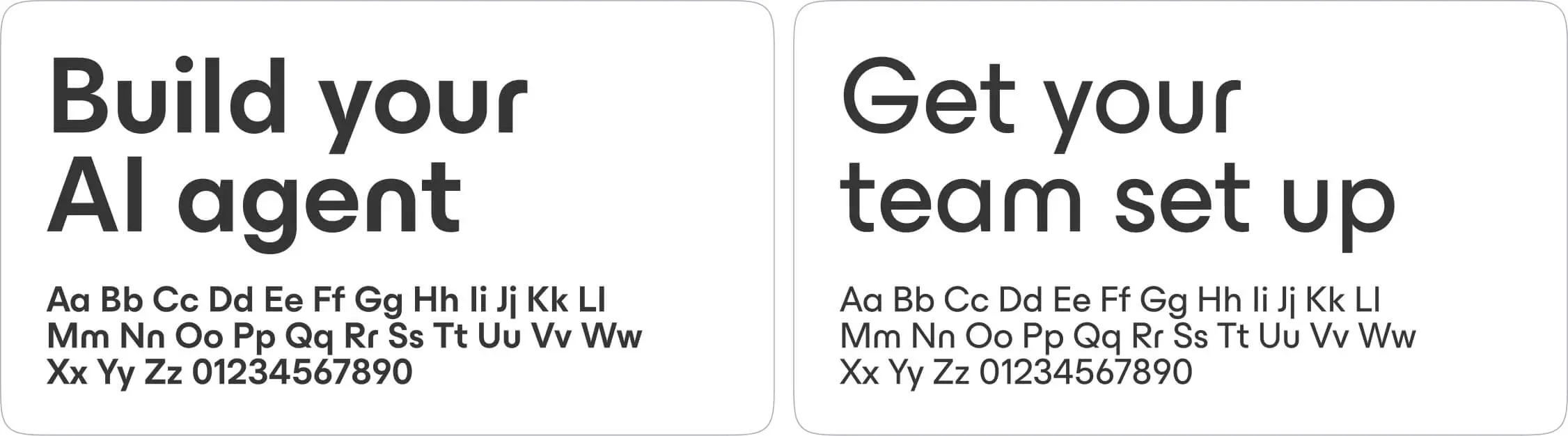
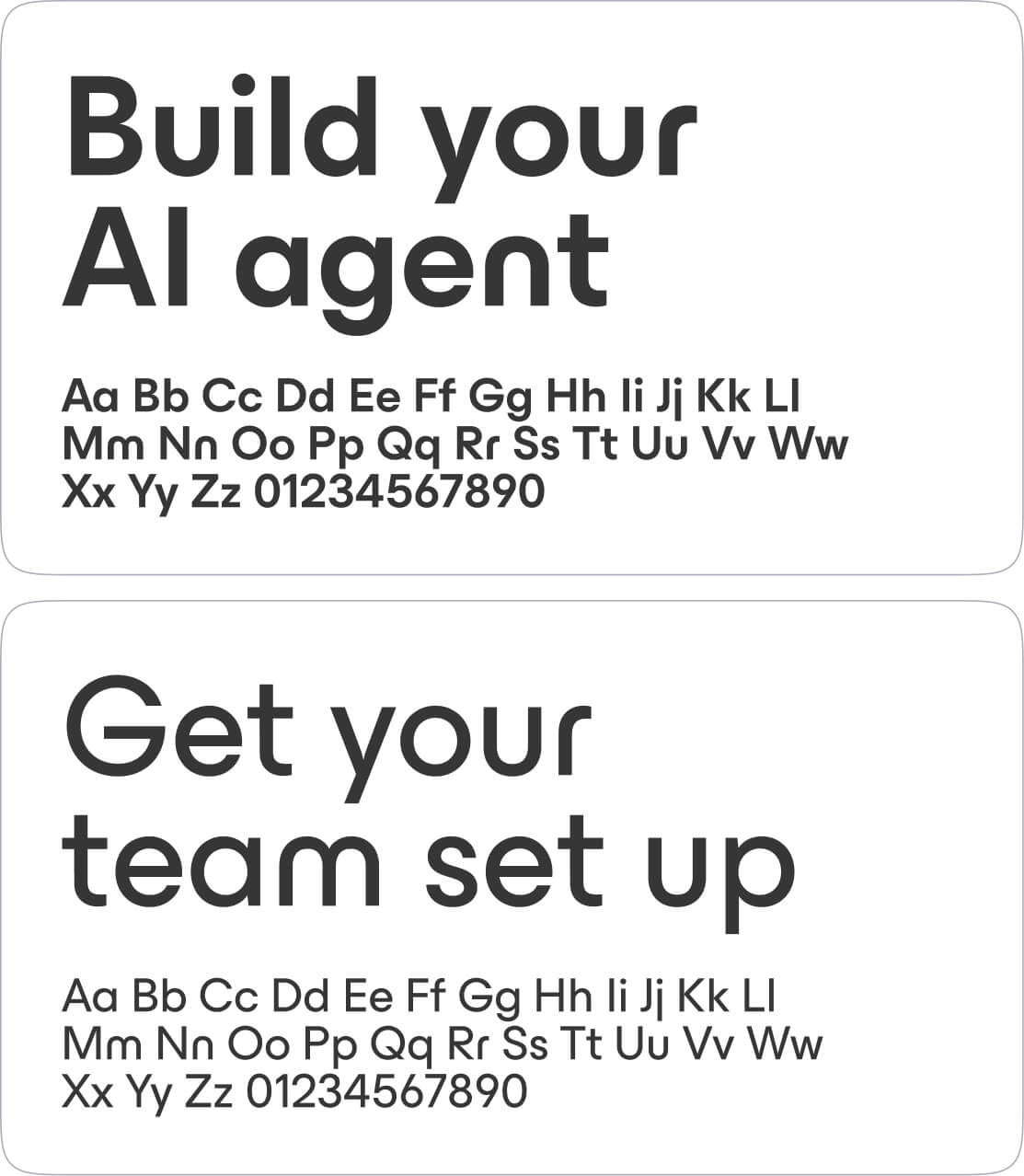
Letters in their purest form
ES Build forms the foundation of the brand’s typography and visual tone. Inspired by Herbert Bayer’s universal typeface, it celebrates geometric reduction and clarity, stripping letters to their essentials. More than a typeface, it reflects a European design tradition of Bauhaus where form meets function, art intersects with technology, and every letter conveys precision.
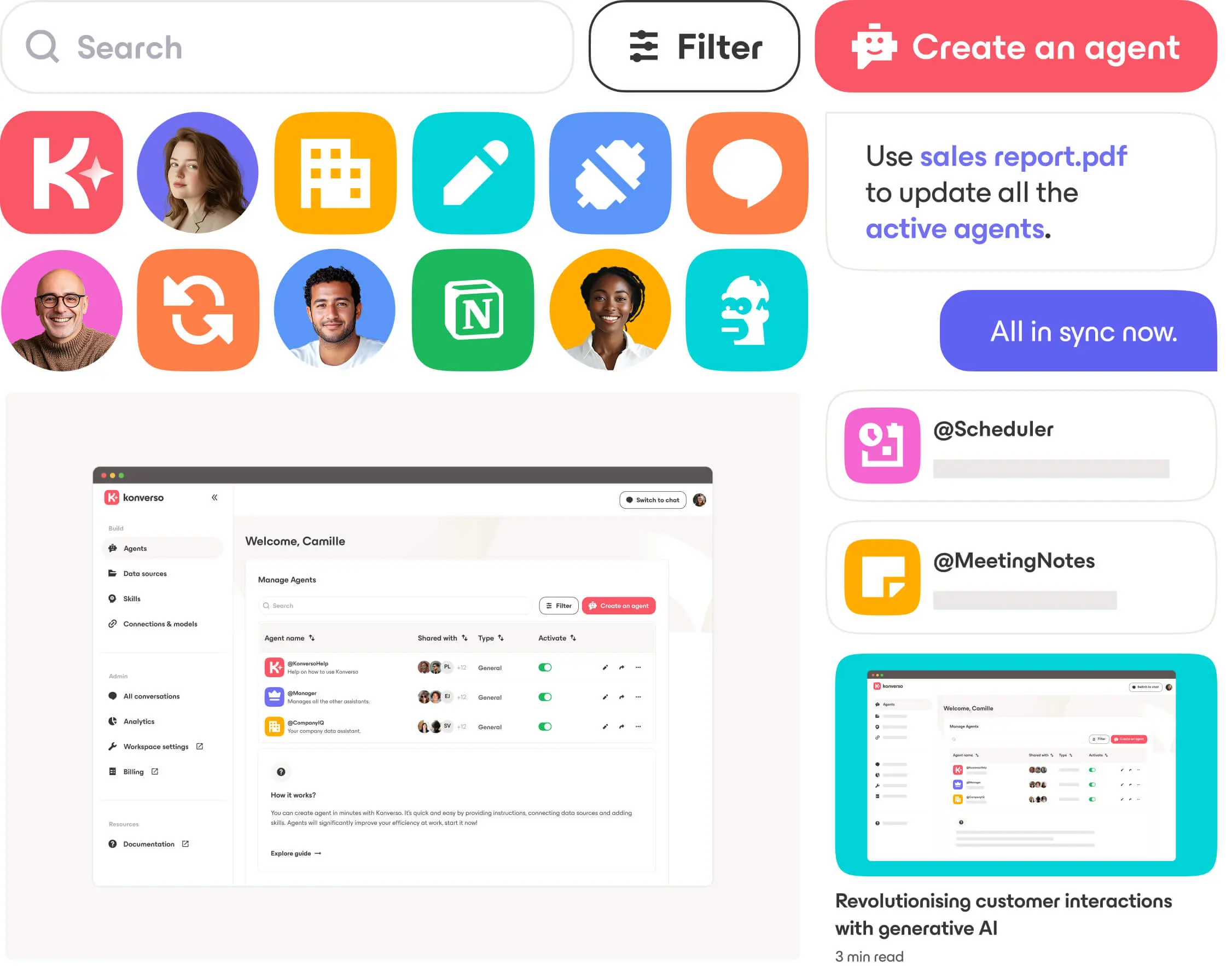
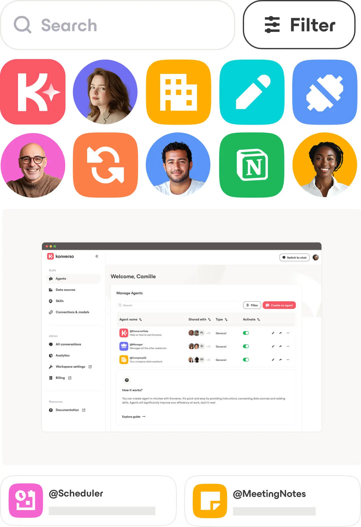
From brand to product
As part of the redesign, I developed a UI direction that could be applied to the product alongside the brand roll-out. Geometric icons and a colour system were created for agent avatars, harmonising with the typeface and highlighting the playful side of productivity. The same principles extended to user avatars, allowing both product and marketing teams to maintain a coherent visual identity.
The face of modern work
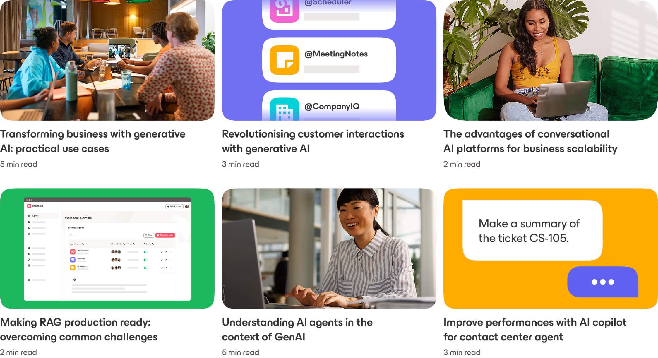
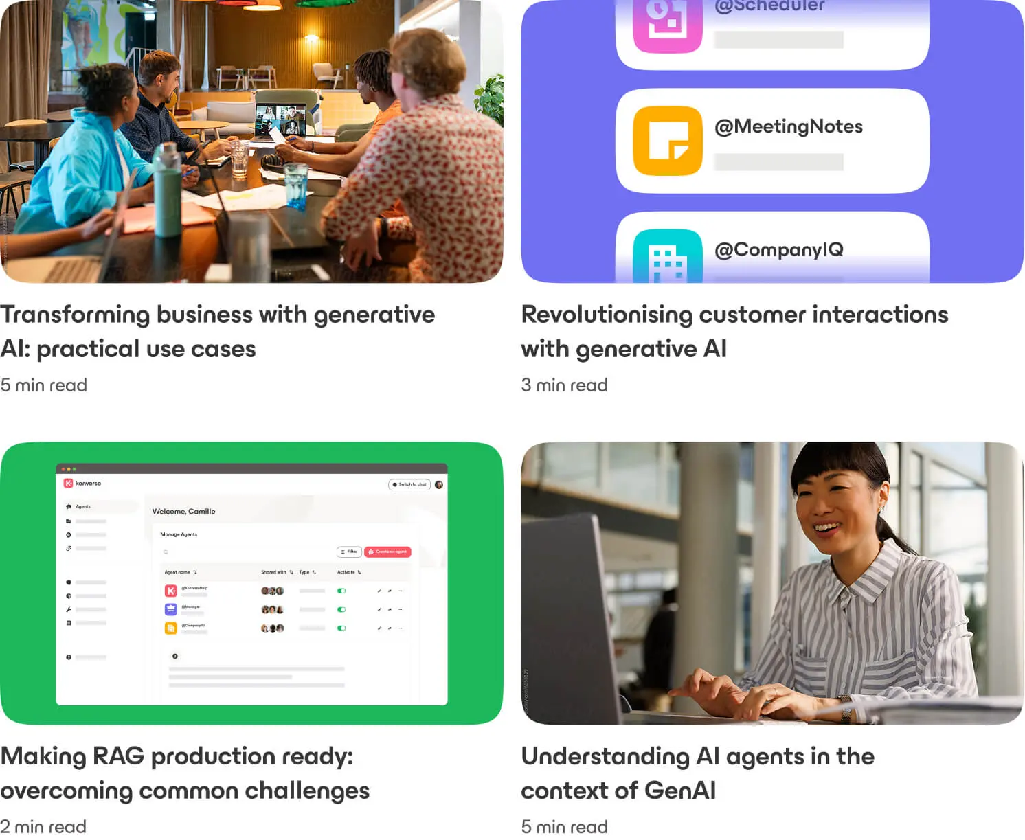
The photography captures authentic, candid moments with people naturally engaged in their day, creating a relatable and human feel. It reflects modern work life, whether in the office, a cafe, or at home, while vibrant clothing and settings add energy and colour. Inclusivity is central, showcasing a range of ages, ethnicities, genders, and abilities, reflecting the welcoming spirit of the brand and the diversity of today’s SMB workforce.
Designing for SEO at scale
Illustrating blog articles while meeting SEO goals is always a challenge for tech companies. By leveraging a design system built from the brand’s core elements, including the photography library, colour palette, and simplified UI, I created a versatile, easy-to-use system designed for high-volume, agile content production.