Label Capital
An early growth equity firm partnering with the next generation of consumer brands.
A label of trust and durability.
A label that makes you feel good.
Working closely with Label Capital, I shaped their new brand identity to reflect the vision of investing in consumer brands that define a generation.
A label defined by its founders
Label Capital invests in the new generation of extraordinary visionaries, supporting entrepreneurs who make a positive impact on everyday life. Each of these founders becomes an ambassador of the Label Capital ethos, embodying the values of trust, care, and long-term vision that define the fund.
The mark that completes the logo
Label Capital’s logo is a typographic statement designed to capture the essence of the fund and its underlying philosophy. Complementing the lettering, a bespoke brand symbol was created to unify the identity. It can form patterns, act as an avatar, or serve as a distinctive sigil across print applications.
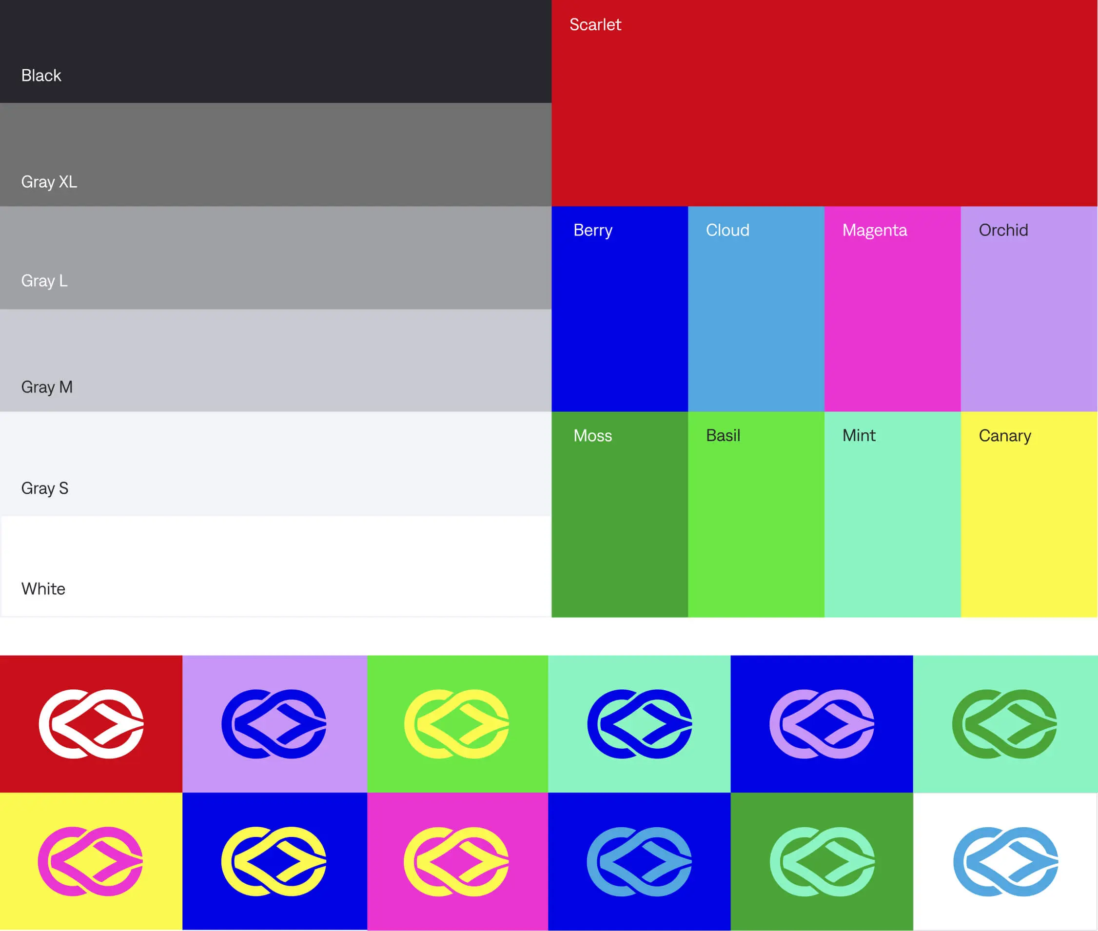
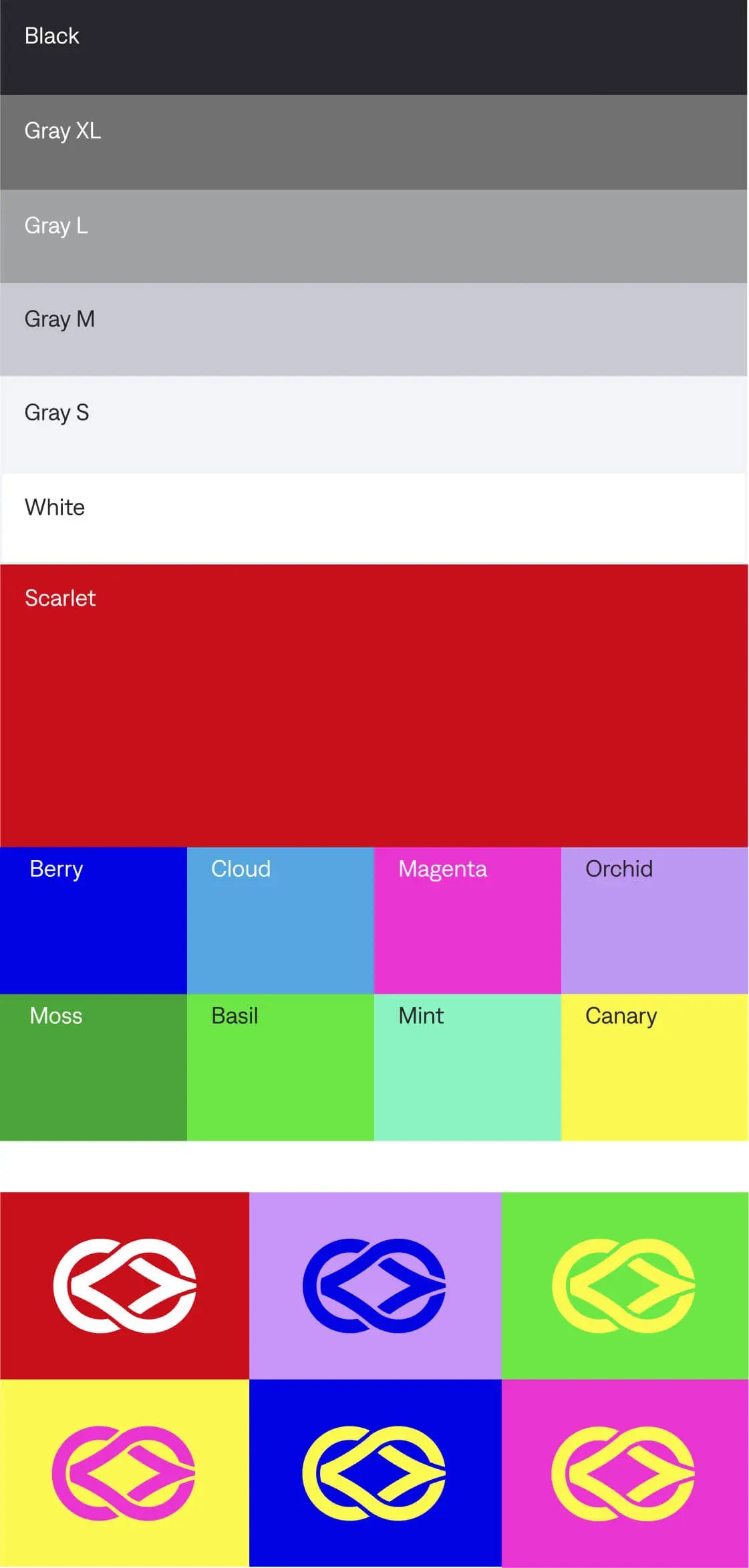
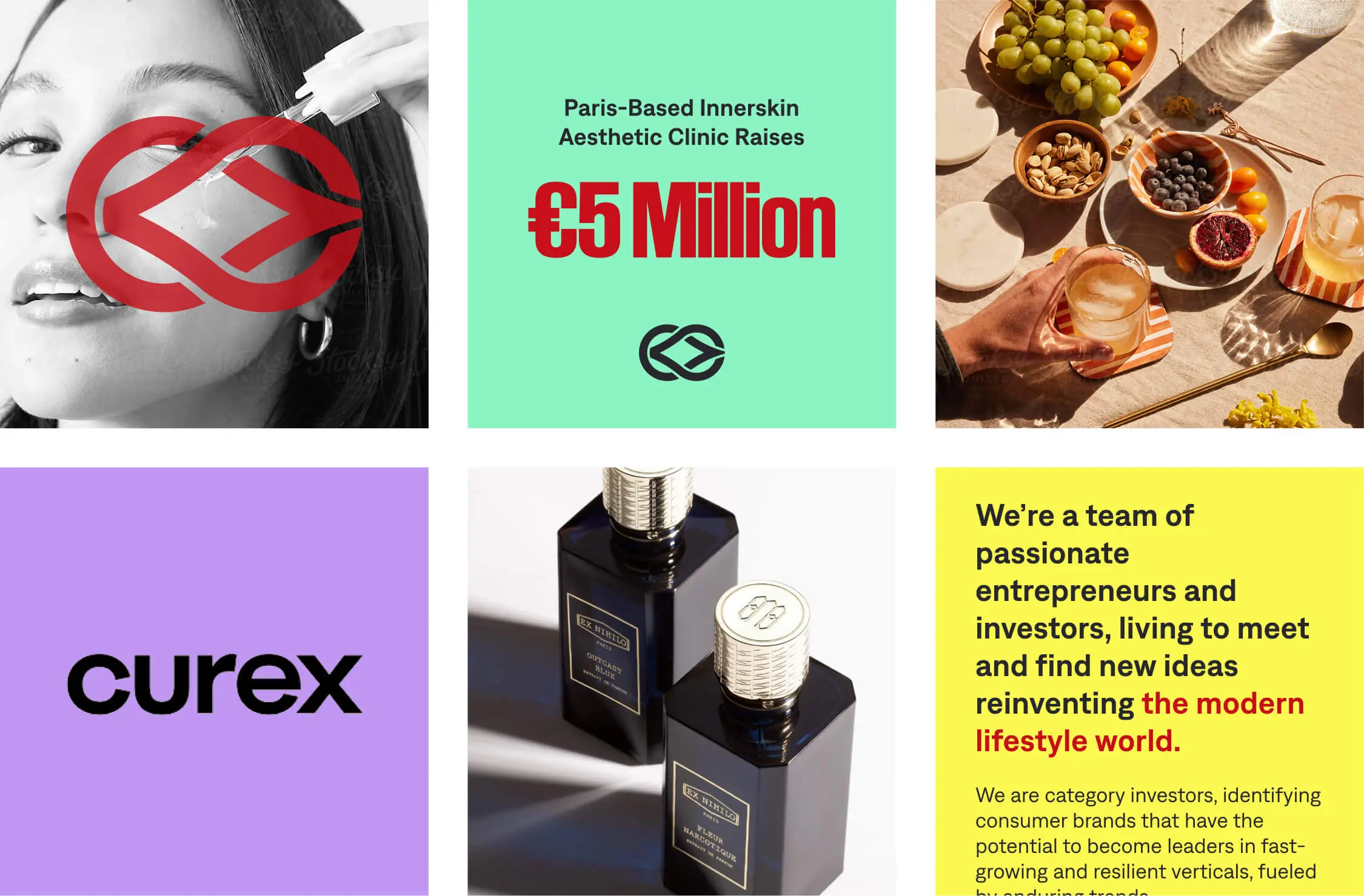
Accent marks on the portfolio
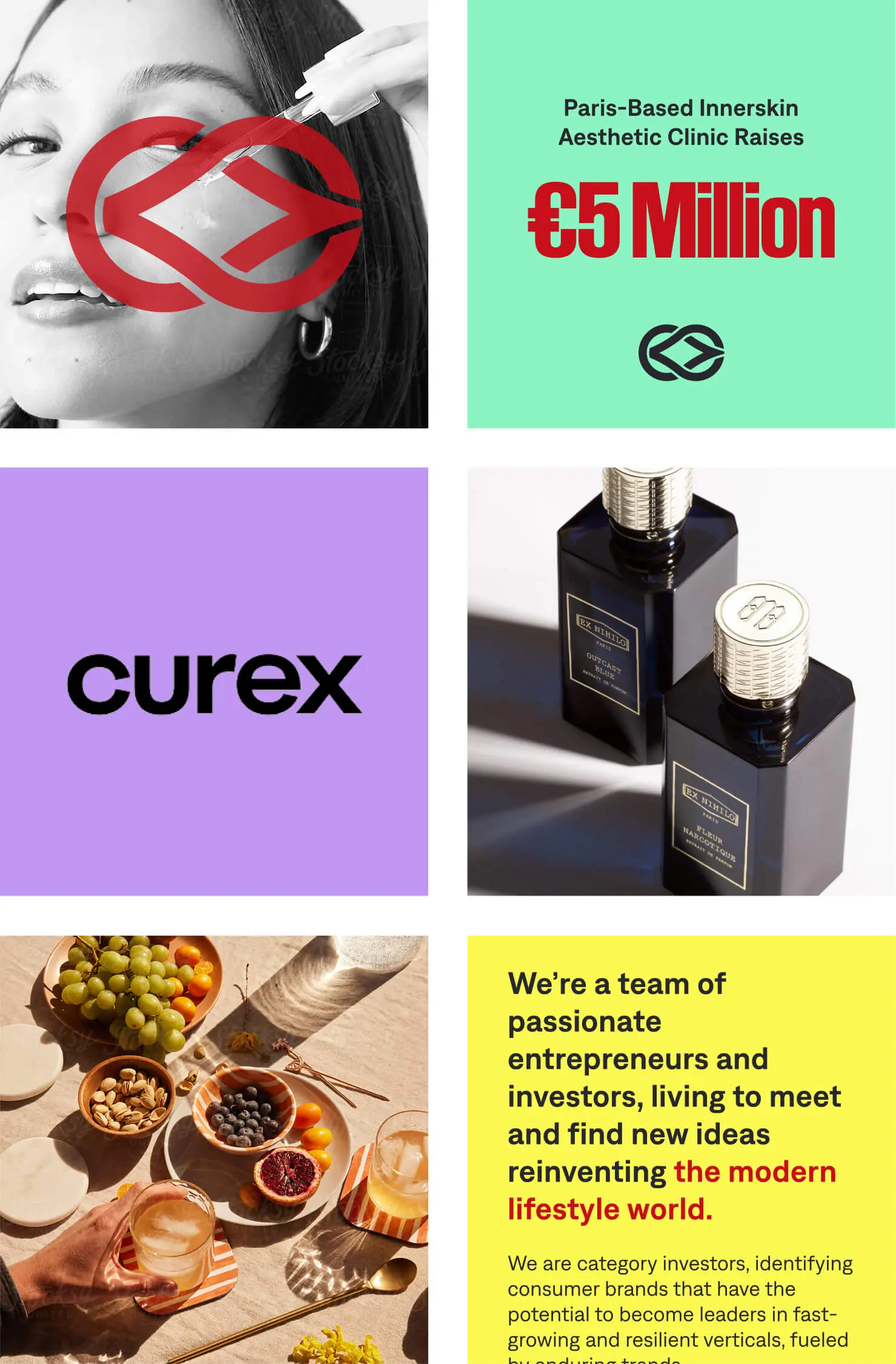
To put the spotlight on the consumer brands’ portfolios, Label Capital’s visual identity is grounded in a minimalist black-and-white canvas.
Through collaborative workshops with the client, we designated scarlet as a bold accent for the logo and symbol, strategically emphasising the label’s sigil within the visual system. The palette is complemented by energetic secondary colours, offering flexibility and vibrancy for social media applications.
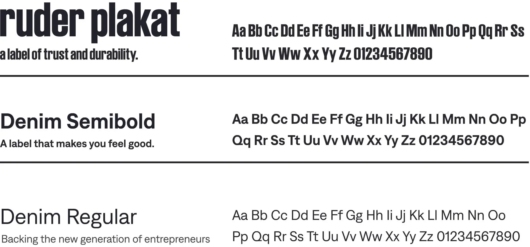
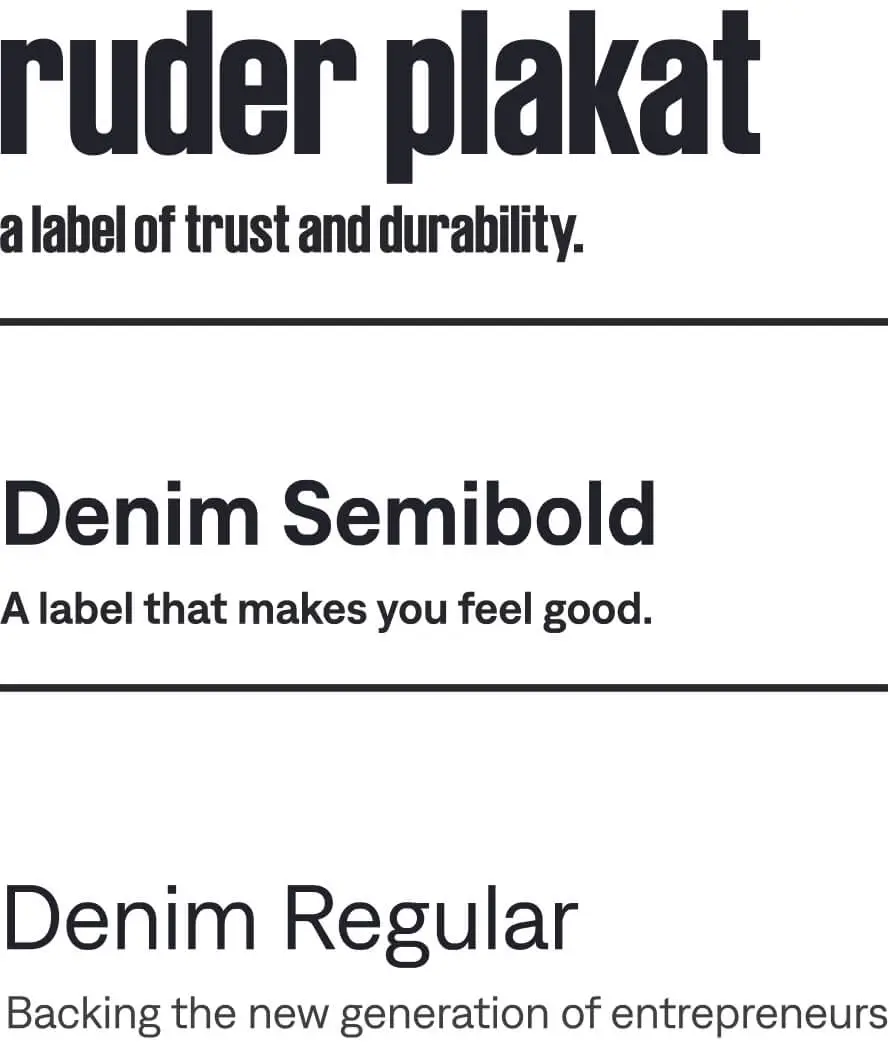
Letterforms that echo identity
Paying homage to the traditions of labels, headlines use Ruder Plakat, echoing the aesthetic of the logo. Paragraph text is set in Denim, a typeface inspired by the spirit and texture of high-quality denim and its labels, reinforcing the tactile, crafted feel of the brand.
Where restraint meets rebellion
The social media strategy expands beyond the black-and-white canvas, embracing vibrant colour energy and portfolio imagery. It leverages the brand’s secondary colours to create dynamic, engaging content that brings the Label Capital portfolio to life on social media.
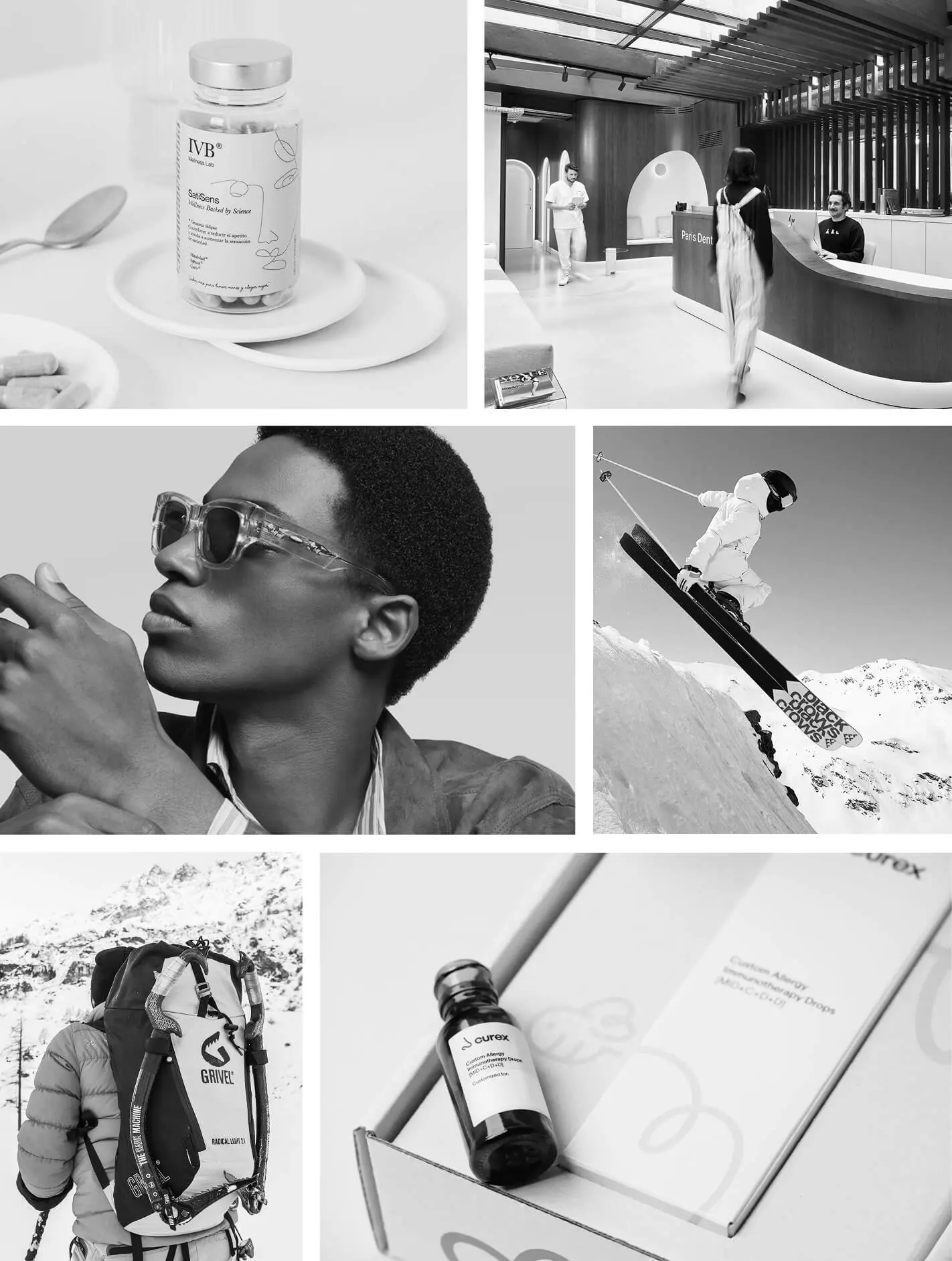
Real moments, distinctive products
The photography captures authentic, candid moments of diverse consumers engaging with Label Capital’s wellness brands, paired with product imagery arranged in thoughtful, pattern-like compositions. The approach balances real-world relatability with the distinctive appeal of each product, highlighting the people who bring the brands to life and reflecting the diversity central to the label.
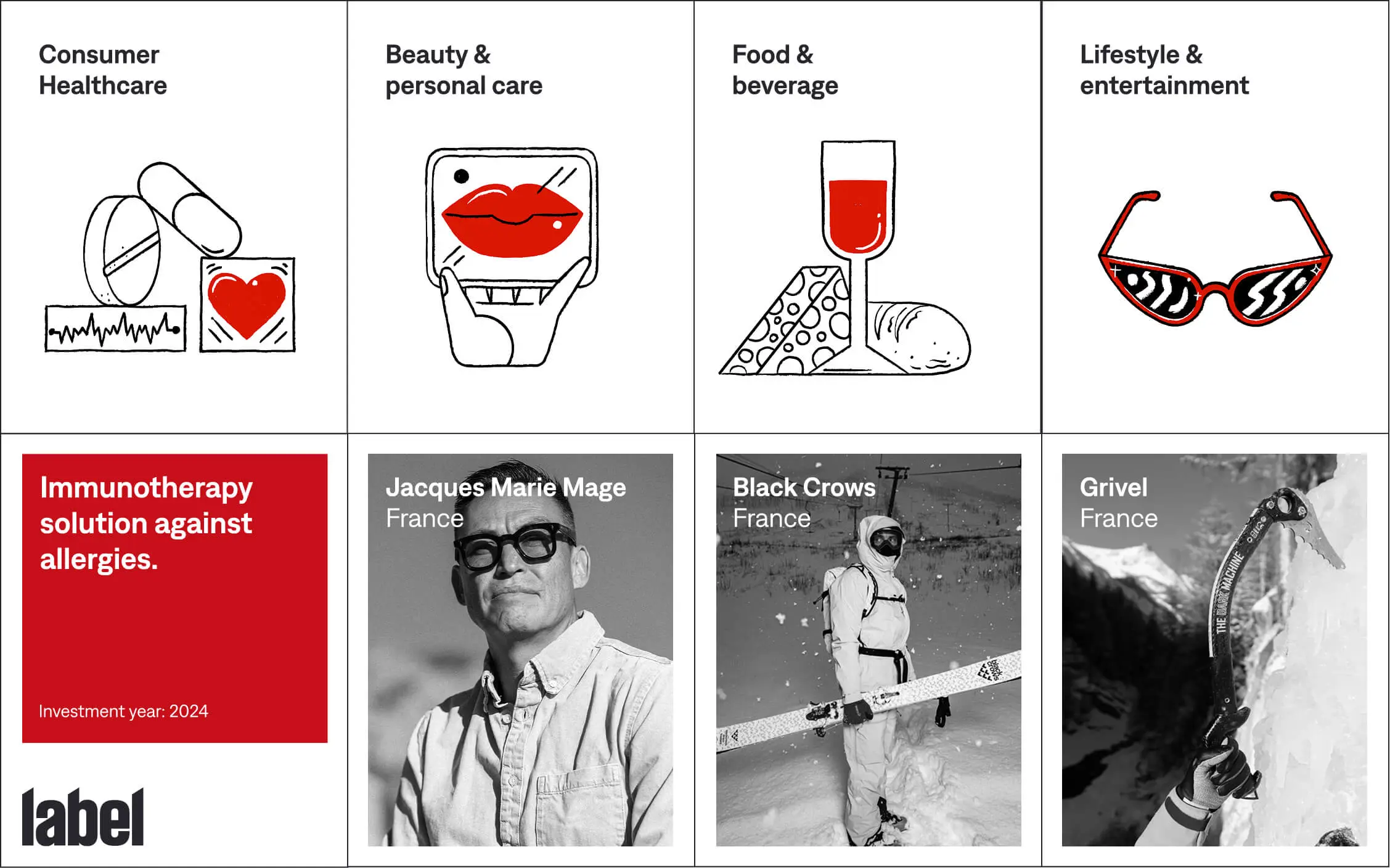
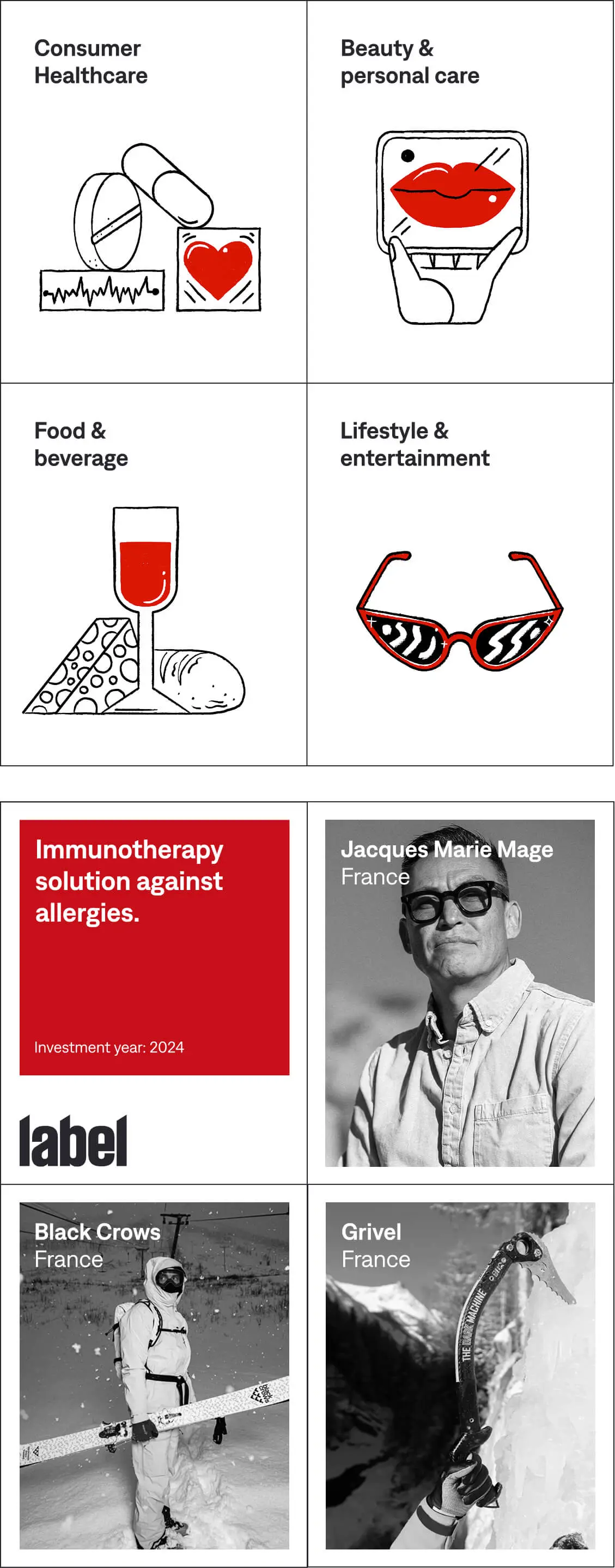
Illustrating the portfolio
To visualise each portfolio pillar, bespoke illustrations were commissioned to capture the essence of each category: ‘Consumer Healthcare’, ‘Beauty & Personal Care’, ‘Food & Beverage’, and ‘Lifestyle & Entertainment’. Each consumer brand is represented within a card, forming an individual ‘label’ within the broader Label Capital family and reinforcing the curated, cohesive identity of the fund.
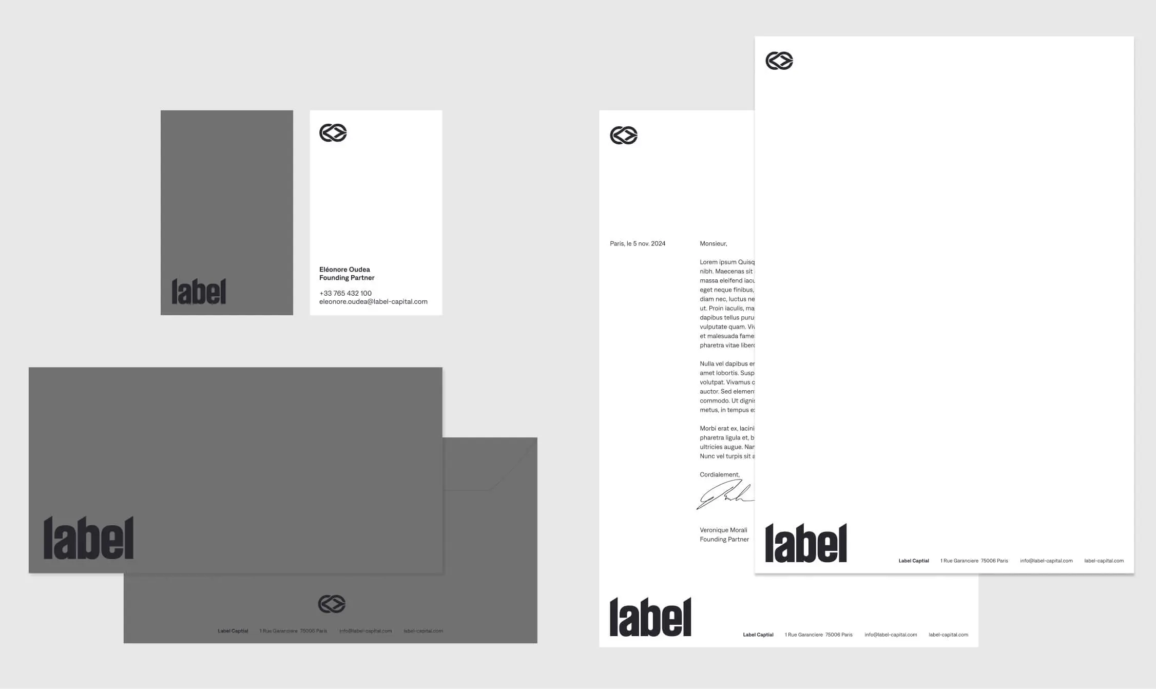
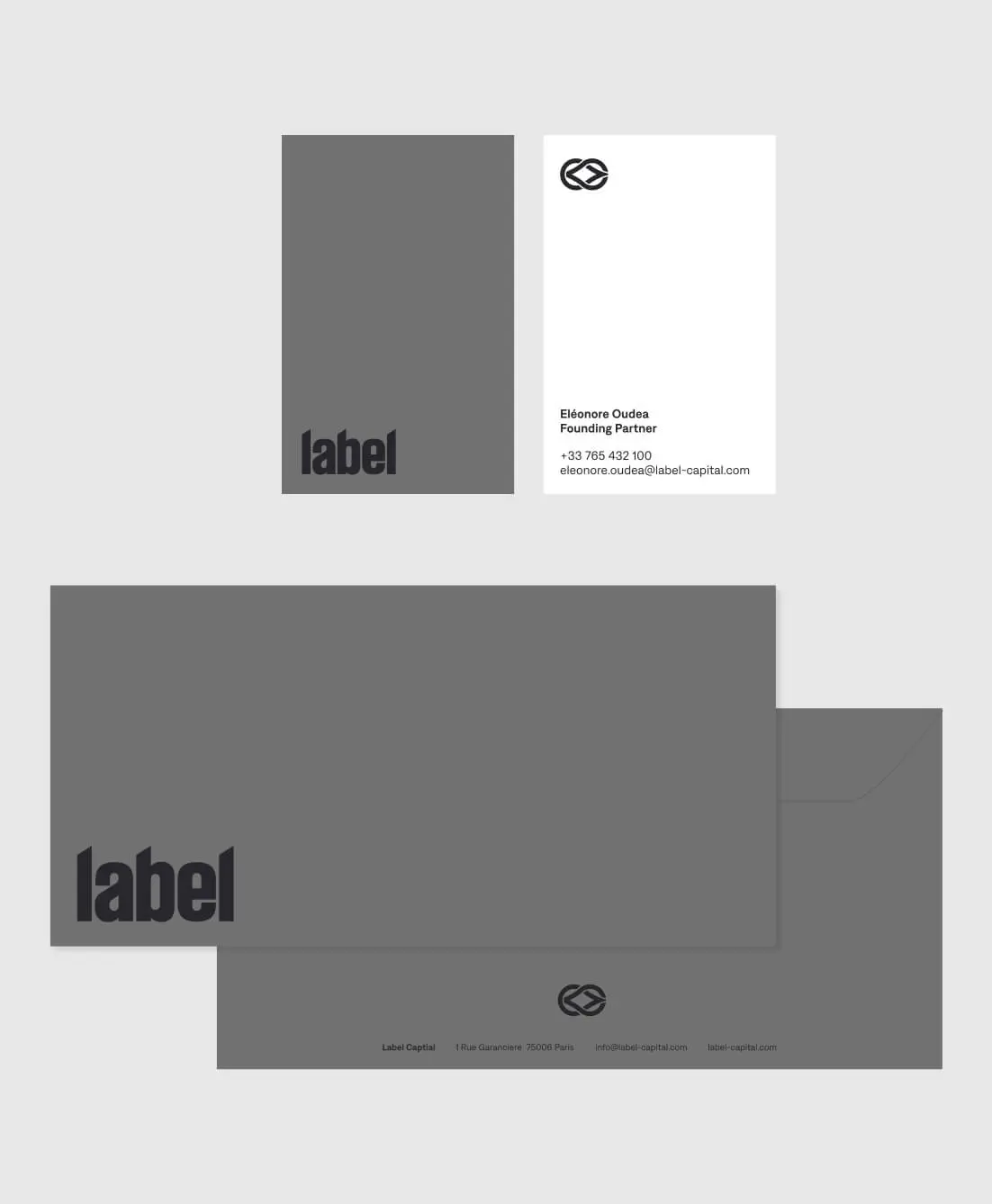
Signature stationery
The brand extends into the physical world through a refined set of stationery. Business cards, envelopes and letterheads use naturally grey paper from the supplier, paired with an elegant rendition of the brand’s sigil. The result reinforces the fund’s sophisticated identity while creating a tangible connection to its visual language.